
In design more, graphical components (eg. step name, step number, notes, annotations, input/output balloons, frequency, condition) can be moved independently of the process step icons
Graphical Component Properties:
Being in the design mode you can select either a process step or one of its graphical components. If you select a process step then its properties are shown in the Properties pane. If, however, a graphical component is selected the Properties pane shows the graphical properties of this component.
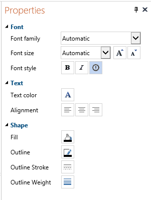
Here, you can define the Font, Text and Shape properties for each individual graphical component.
If you choose for Automatic Font family, Font size, Font style (button  ) or Text color then the values defined in Diagram font in the Layout tab will be used.
| • | Use the Fill to change the color of the component box. |
| • | Use the Outline to change the color of the line around the component box. |
| • | Use the Outline Stroke to change the type of the line around the component box. |
| • | Use Outline Weight to change the thickness of the line around the the component box. |
Moving Graphical Components:
The following graphical components of a process step in the diagram are automatically moved together with its step icon keeping the relative distance between them unchanged:
- Step Name
- Step Number/tag and Roles (together as one label)
- Note
- Annotation
- Input Documents Balloon
- Output Documents Balloon
By moving a component you changed the relative distance between it and the corresponding step. If you move e.g., a step name far to the left and then the step itself also to the left then it might happen that this name component falls outside the left border of the diagram pane and becomes invisible. To keep the graphical components always within the diagram pane the relative distance is automatically shortened in such a case.
Conditions and frequencies (for a Choice and Decision) and labels (for a Parallel) decorate the outgoing lines rather than the steps. Since they are more related to the destination than to the source step they are automatically moved when a the arrow head of the outgoing connection is moved. You can change the relative position of these components as well.
Other graphical components related to a step can not be rearranged. They are always automatically moved when the step icon is moved (for example, Risk point marker, Description and Remarks indicators).
Resizing process step components:
Most graphical components get the width and height depending on their actual content. You can resize them but you can also change their content by changing the values of the properties. The behavior depends on what you do first.
If you do not resize the component but change its content the component will resize automatically (as far as this is possible). If you first resize the component and then change its content then the component will keep the previously specified size because it was already decided by the user.
The text inside a component will be always wrapped. Notes, conditions, frequencies and labels are initially left aligned, annotations, names and roles are initially centered. You can change these properties for each individual graphical component.
The texts inside input/output balloons are wrapped per item.
The input and output balloons are limited to 4 items in the automatic arrangement.
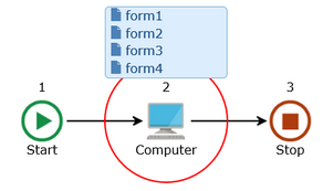
If there are more items the user can extend the hight of the balloon in the design mode to show more items if necessary. Just click on the Design tab, select the balloon and make it bigger to show the other items.
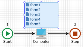
If you switch back to the mapping mode the size remains unchanged, even when you hide the balloons and show them later again.
Annotations
You can create one extra Annotation graphical component for each process step.
Select a step and click the Annotation button in the Add group of the Design tab.
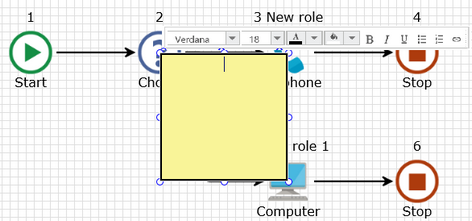
A yellow square is added to the diagram. You can immediately start entering the text of the annotation. Unlike for the other graphical components you can format parts of the annotation text independently. Use the bar above annotation box to choose for font family, size, style, color, background color and to decide on the style of a list. The annotation component has also its own formatting properties. You can set them to decide on the common font color, font style and the text alignment. After entering a text you can resize the box an move it to the required relative position.
Just click on the annotation component and drag and drop it on another place. Click one of the small blue circles on the edge to resize it.
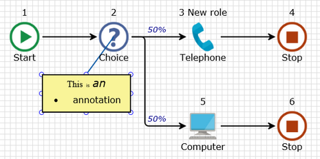
Since there can be many annotations on the diagram there is always a line drawn between the center of the step icon and its annotation.
To remove an annotation just select it and press the <Del> key or the  button.
If you select a step for which the annotation was created then the text of the annotation will appear also in the Annotation pane. So, you can edit it either in this pane or directly on the diagram inside the annotation graphical component. You can also type a text in the Annotation pane even if you did not create the graphical component for it yet. The text from the pane will automatically appear in the component at the moment you create it in the Design mode.
Text Blocks
In order to add a new text block to the diagram press the Text Block button in the Add group of the Design tab. The new text block will be put over the currently selected component with the initial text 'Text'.
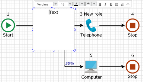
You can start editing this text in the same way as for annotations. The difference between a text block and an annotation is that the text block is not linked to any of the process steps and it is initially transparent. Unlike the annotation the text block does not have its corresponding pane where you could edit its text.
You can use a text block to create a grouping rectangle around some process steps that have something in common. Create a text block, remove the default text and specify the block outline. You will get a transparent square. Then, you can resize and move it in order to embed steps in the group that you want to distinguish.
You can copy an existing text block with all its formatting properties and paste it in the same or another diagram.